Comfama: Wayfinding for the Recreational Network
Bilingual wayfinding for Comfama's recreational network across Antioquia
Comfama is one of the oldest and largest cajas de compensación in Colombia. Founded in 1954, it operates schools, libraries, health services and a network of recreational parks across Antioquia. The parks are where most families experience the brand: weekends, school holidays, company outings.
By 2013, three of the recreational sedes needed a unified wayfinding system: Parque Recreativo Copacabana, Sede Pedregal, and Sede Girardota. Each site had grown its own signage organically, and none of it agreed with the others.
Role: Creative Director and Lead Designer
Three sedes with different scales, different building stock and different landscapes around them: a pure-concrete urban site in Pedregal, a wide green park in Copacabana, a smaller community sede in Girardota.
The system had to be the same in all three without flattening what made each site specific. It also had to work in Spanish and English — Comfama hosts international visitors and corporate clients — with accessibility considered from the start.
I designed it in two layers.
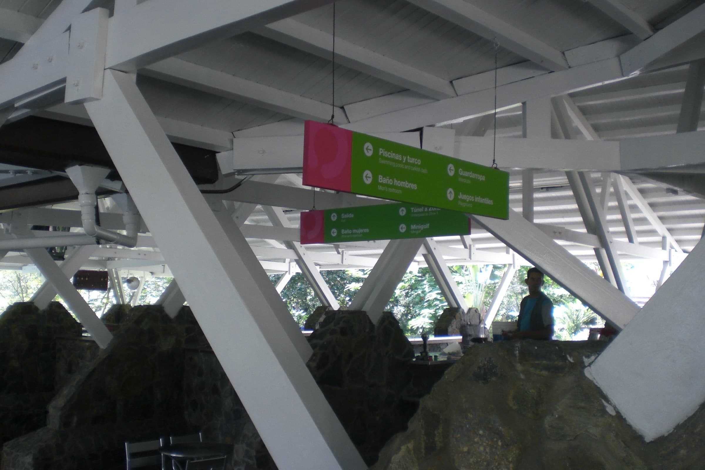
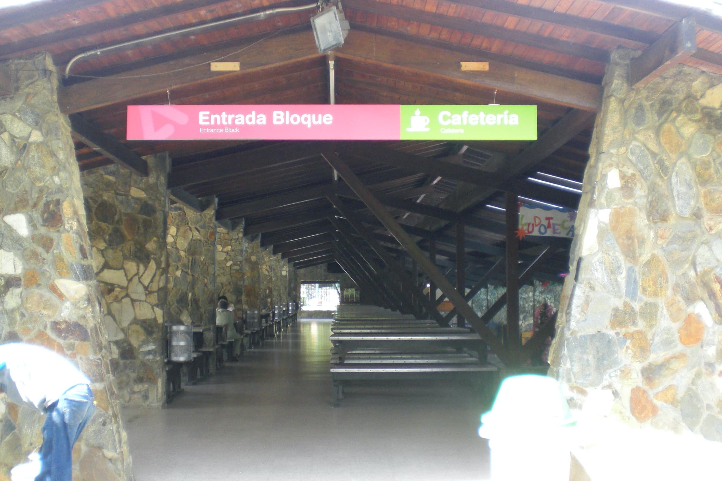
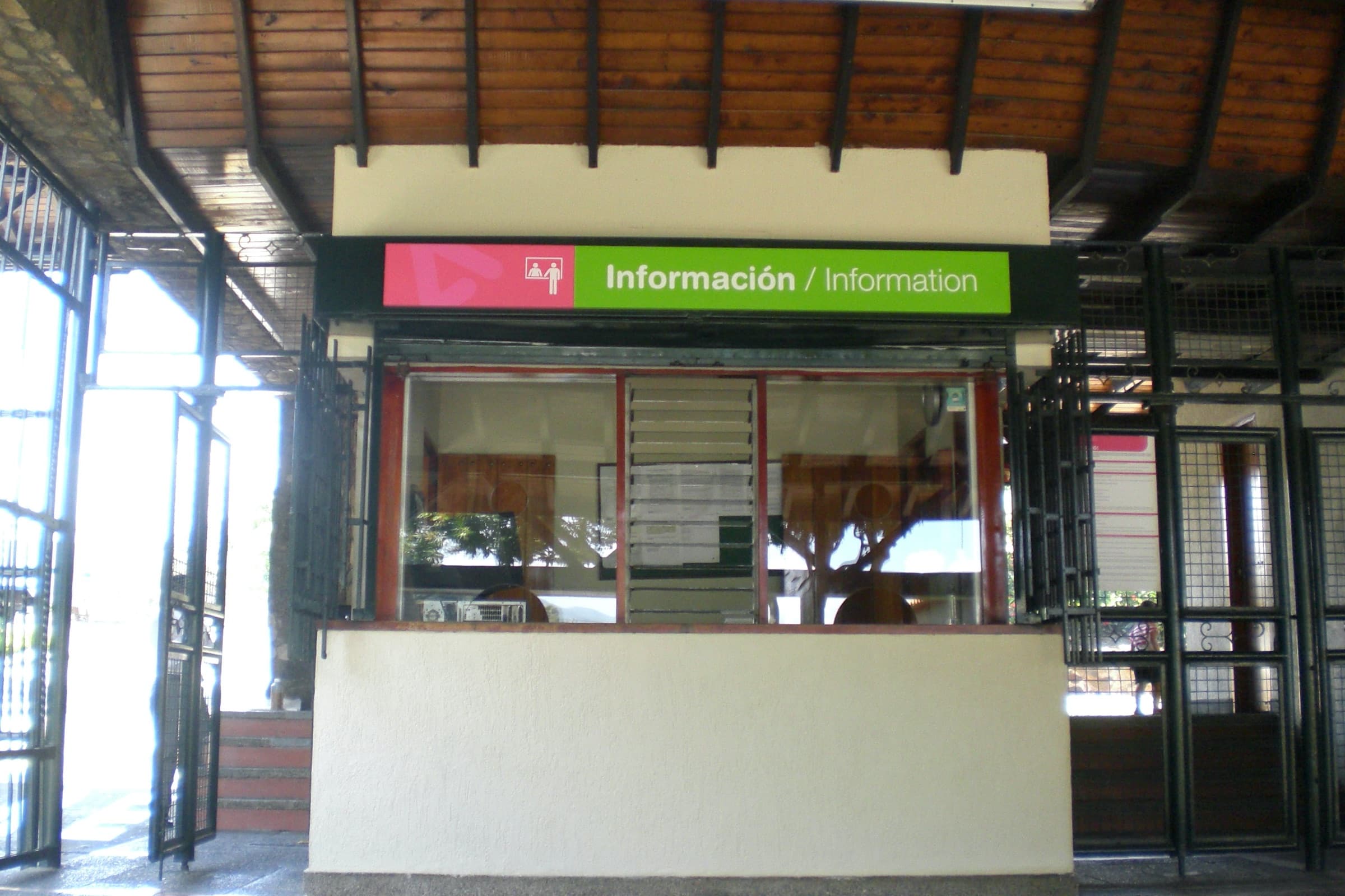
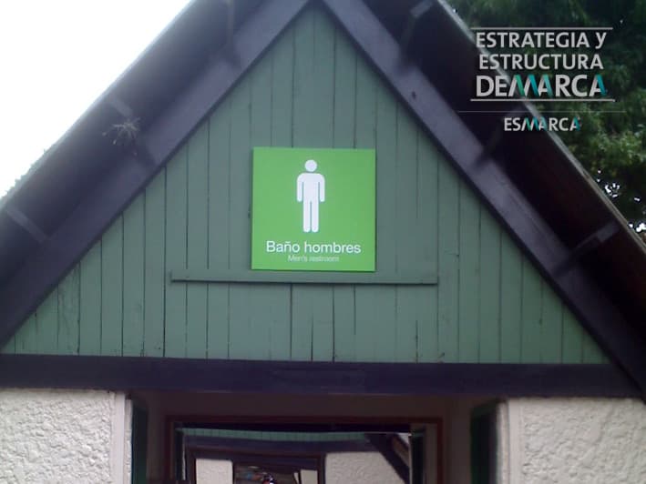
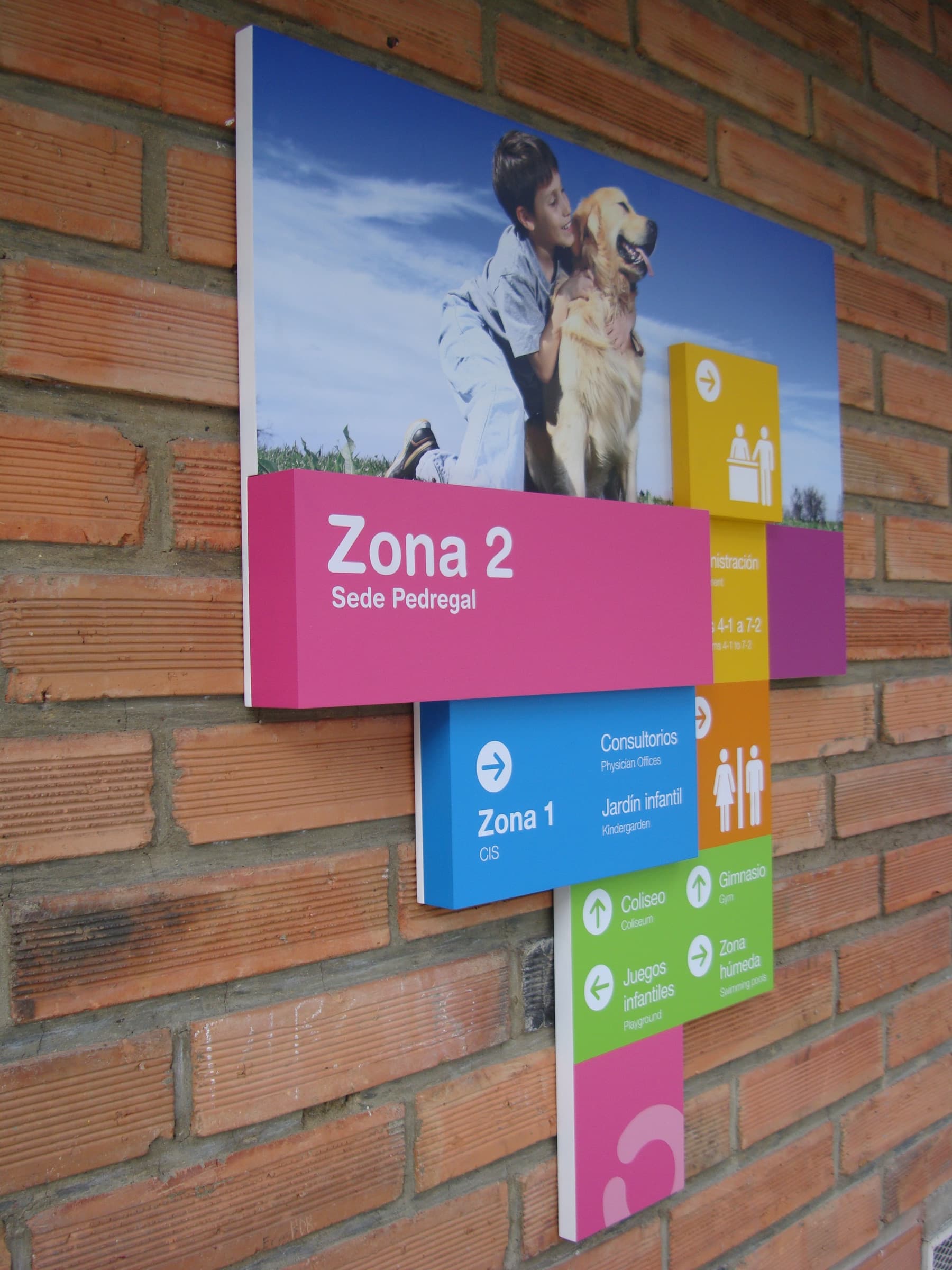
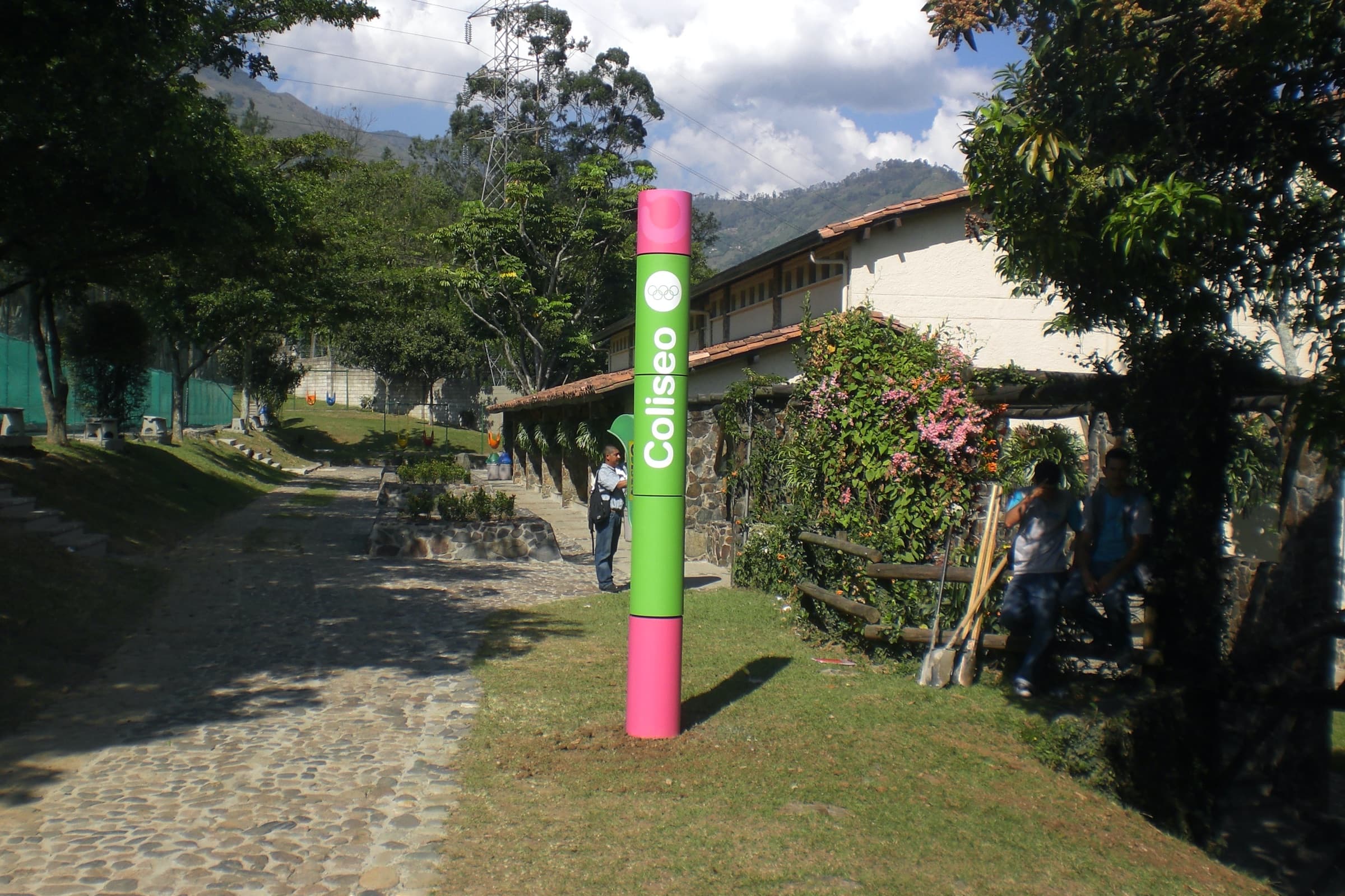
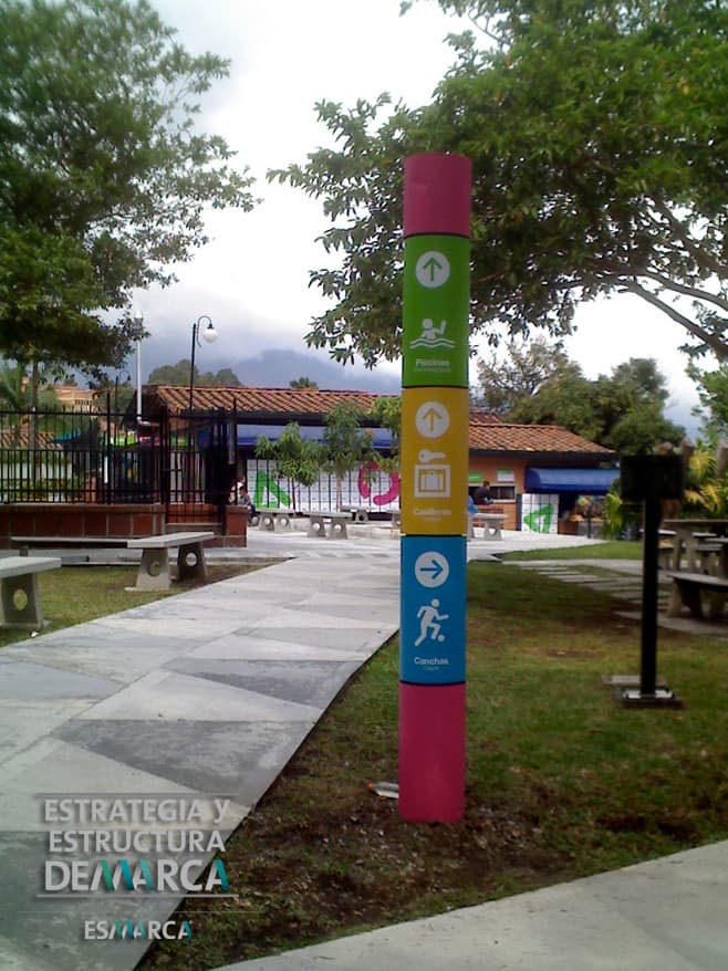
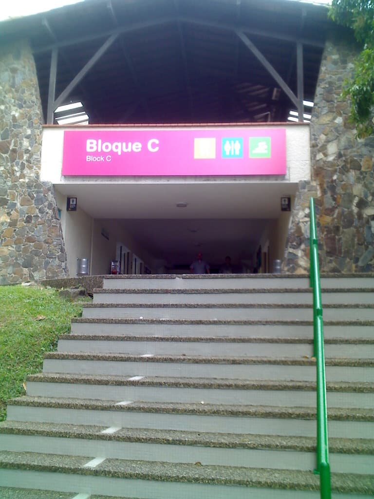
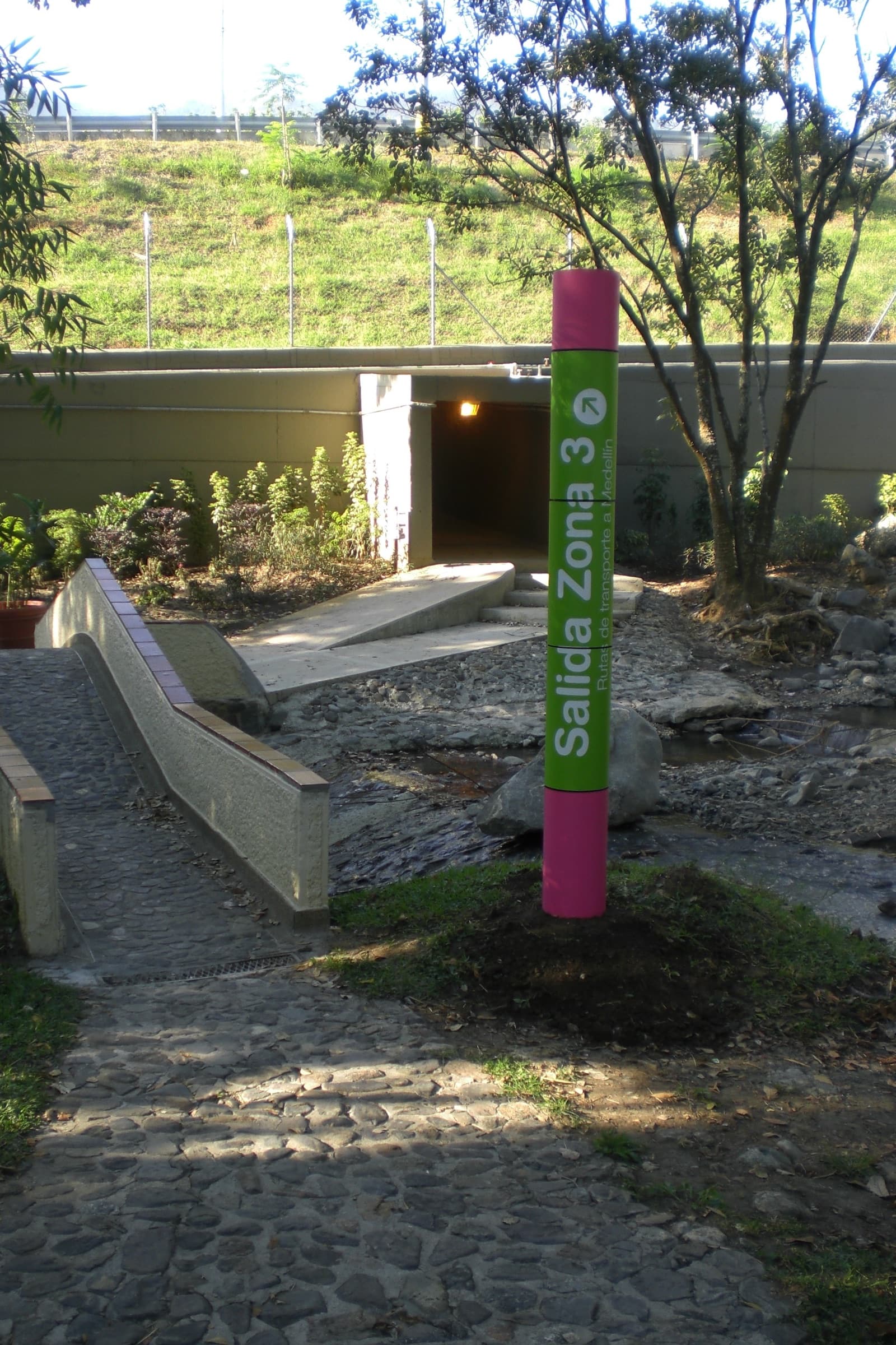
The first layer is functional: bilingual signs, clear hierarchy, outdoor banners, totems, mid-scale wall signs and small room markers. The same typography, the same color logic and the same materials across all three sedes.
The second layer is emotional: seven verbs that describe what a family actually does in a Comfama park — Brinca, Sonríe, Baila, Sueña, Silba, Abraza, Disfruta. They live on the large outdoor pieces. They are not directions. They are the reason for the place.
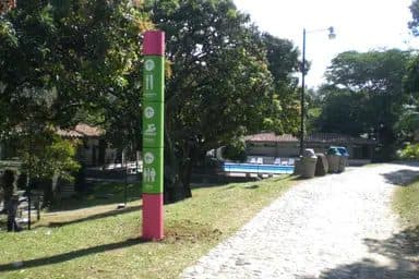
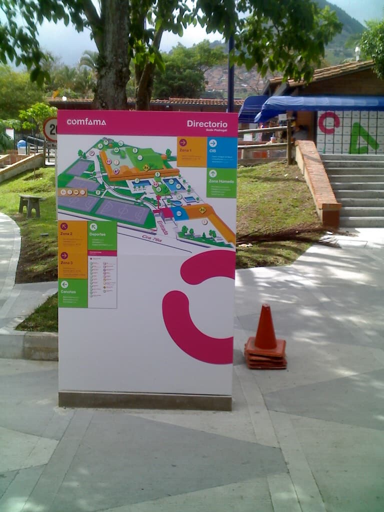
The system covers the full visitor journey at each sede: entry banners and large outdoor pieces, vertical totems at decision points, mid-scale signs for spaces like Gimnasio, Biblioteca, Piscinas, Restaurante, Canchas, Juegos infantiles and Administración, and small markers for rooms, restrooms, lockers and exits.
Materials were chosen by surface and weather exposure: printed banners on galvanized steel frames for the outdoor entry pieces, square tube structures for the freestanding totems, adhesive vinyl on smooth surfaces, and acrylic for indoor mid-scale signage.
The Pantone palette holds the brand together: 130 C, Process Cyan C, 376 C and 213 C. The same four colors appear in every sede regardless of context.
A bilingual wayfinding system for Comfama's recreational parks in Antioquia. One visual language adapted to three sedes: Parque Recreativo Copacabana, Sede Pedregal, and Sede Girardota. Functional signage in Spanish and English, with an emotional verb layer that names what these places are for.
- Languages
- Spanish / English
- Client
- Caja de compensación familiar
Documentation
Directional
- Santiago Valencia VeraCreative Director and Lead Designer/ INSIGNIA Estructura de Marca