Ruta N Medellín: Wayfinding and Identity System
Bilingual signage and identity for Medellín's innovation hub
Ruta N is Medellín's center for innovation, science, technology and business. The corporation was created in 2010 as a partnership between the city and the private sector, with the goal of making Medellín a Latin American leader in technology-based business across three sectors: health, energy, and ICT.
The complex opened in November 2010. It hosts startups, corporations like HP, investors, universities and public bodies. The space had to work for all of them.
Role: Creative Director and Lead Designer
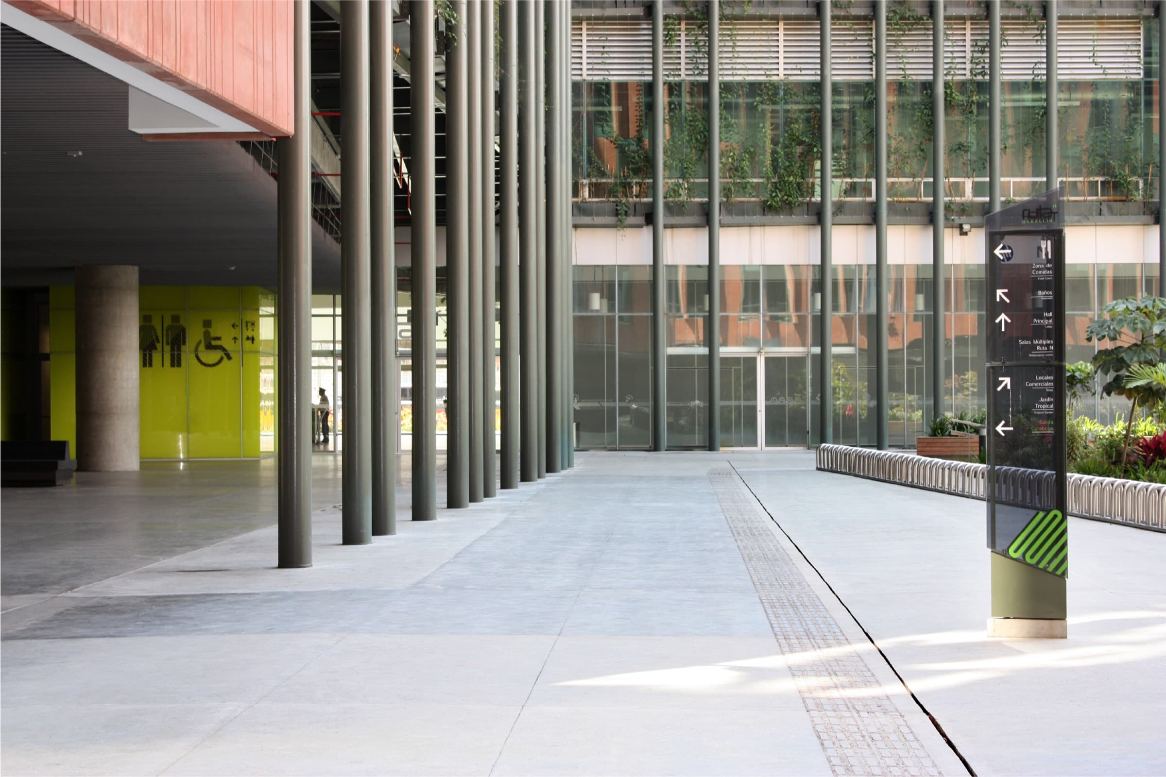
The architecture is bold: two towers, glass facades, exposed concrete, a tropical patio in the middle. The wayfinding could not fight the building. It had to live with it.
It also had to be bilingual from day one — Spanish for locals, English for the international visitors and partners the corporation was built to attract — and fully accessible, with Raster Braille on every key sign.
The name did half of the conceptual work for me. Ruta N: a route. I built the visual language from the marks a city uses to guide movement — crosswalks, lane stripes, street markings.
A family of diagonal stripes and textures travels through the building. It marks parking spots, identifies floors, signals services, and turns glass walls into portraits — Michael Porter, Steve Jobs, Victor Hugo — chosen by the corporation as references. The textures play with the architectural light: frontal white LED by day, green rebound light at night.
The system covers every level of the complex: parking, lobby, multi-purpose rooms, meeting rooms, offices, terraces, and outdoor totems.
Materials change with the surface: adhesive vinyl on glass, acrylic on walls, smoked glass and iron structure for the outdoor totems, lacquer paint on polished concrete in the basement.
The brief I held myself to, together with the client team: a first-time visitor should be able to reach any room in the complex without asking for help. Every key sign is bilingual and carries Raster Braille.
A complete wayfinding and identity system for Ruta N, Medellín's center for innovation, science and technology. The signage lives with the architecture, works in two languages, and includes Raster Braille for accessibility across every level of the complex.
- Area
- 65 000 m²
- Towers
- 2
- Languages
- Spanish / English
- Accessibility
- Raster Braille
- Client
- Public-private innovation hub
- Launch
- 2010
Exterior


Signage Outdoor


Signage Indoor


Identity Color


Identity Portraits


Identity Pattern

- Santiago Valencia VeraCreative Director and Lead Designer/ Estrategia y Estructura de Marca
- Maria Cecilia TobónArchitect/ Corporación Ruta N
- Emerson MarínArchitectural Designer/ Independent
- Lina María ColoradoCommunications/ Corporación Ruta N
- TecniplexProduction and Manufacturing/ Tecniplex S.A.
Nominated, XVI Premio Lápiz de Acero 2013. Visual Identity category.